OverviewAbout

A selection of commissioned projects. Ranging from brand identity, to print design, web design, and environmental design, these projects are undertaken either in-house at a design studio or as an independent freelancer.


Baby Bistro

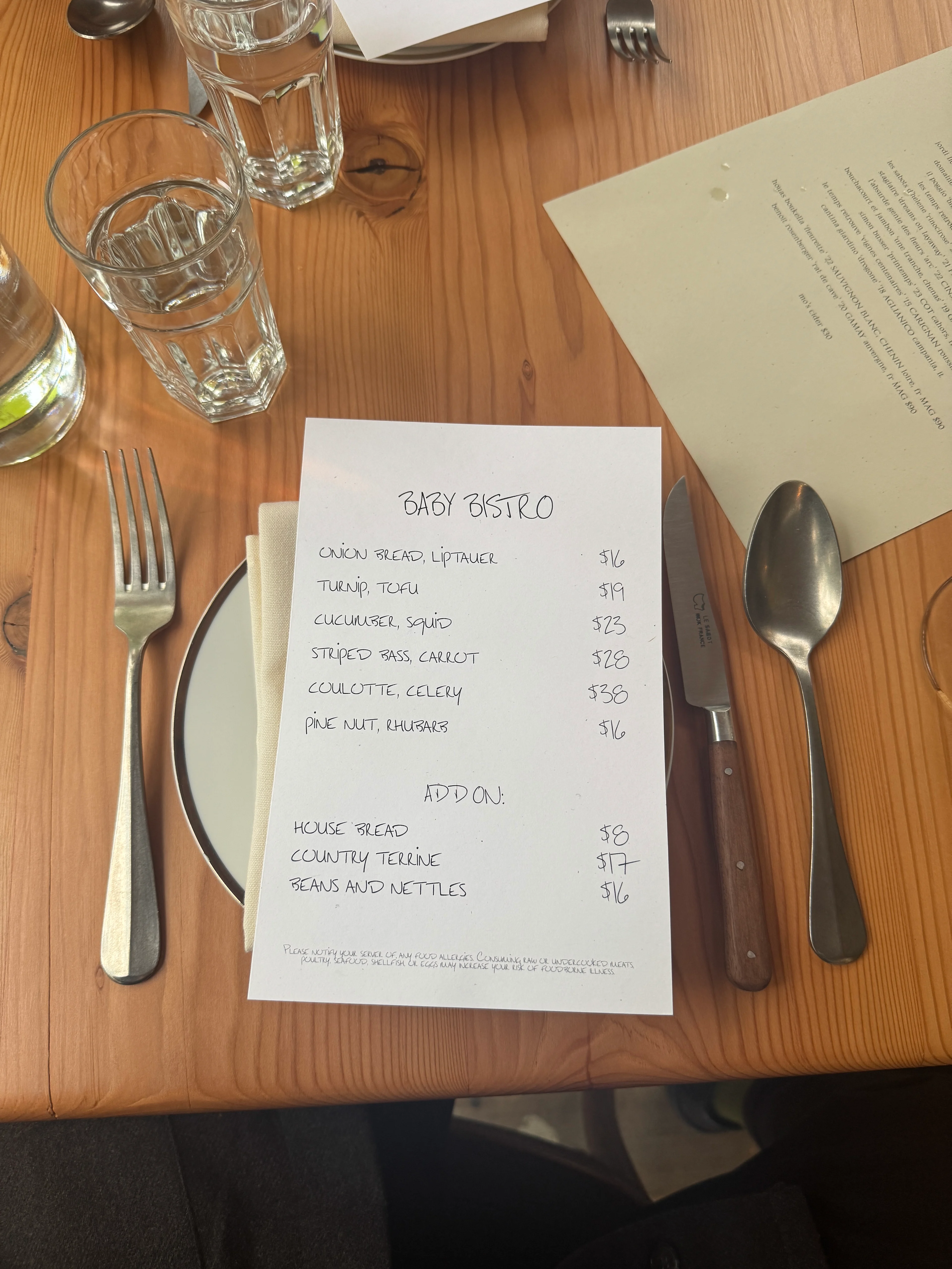
Brand identity, website and type design for Baby Bistro, a restaurant in Victor Heights, Los Angeles. Led by Andy Schwartz, who leads the natural wine program, and chef Miles Thompson, whose cooking The New York Times describes as "the taste of Los Angeles right now."

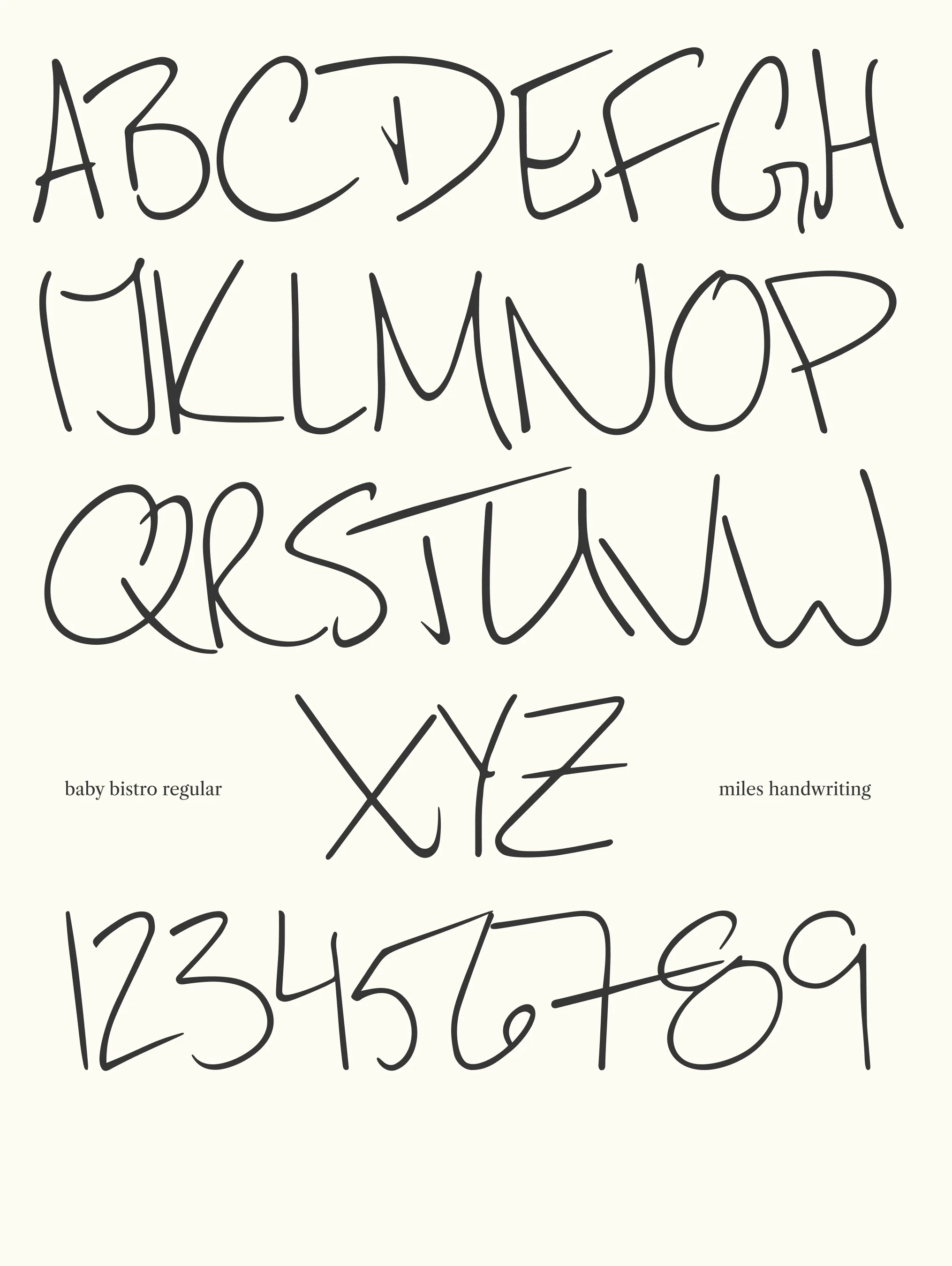
I worked closely with Miles and Andy to develop the restaurant's visual identity, beginning with the transformation of Miles's handwriting into a custom typeface that anchors the brand across menus and ephemera (with assistance from Eko on the typeface conversion). The result is a design that mirrors the restaurant's approach—precise technique presented with an easygoing, unpretentious ease.

The identity extends to Baby Bistro's website, designed to reflect the intimate, genuine hospitality of dining in their converted home space. Baby Bistro opened in 2023 as a pop-up before establishing its permanent location, where the menu of about six dishes changes frequently to accommodate seasonal ingredients and Miles's creative output.

Role: Art Direction & Website Design

In Collaboration with: Miles Thompson, Andy Schwartz, and Eko (typeface conversion)

Year: 2024-2025

baby bistro menu with the custom handwriting by chef miles
all caps and numbers only, baby bistro regular typeface (designed with eko setiawan)

Sign up for occasional updates, announcements and special events.

Yardy World: Island Time

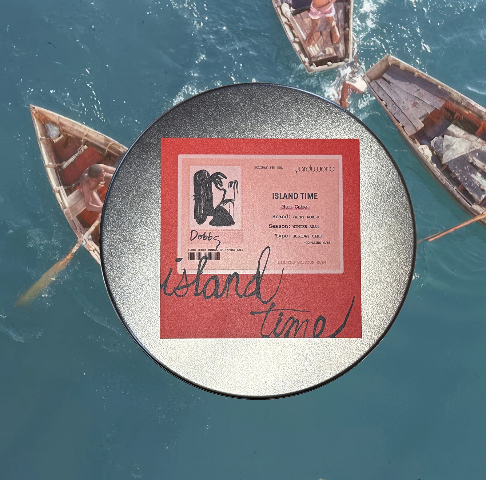
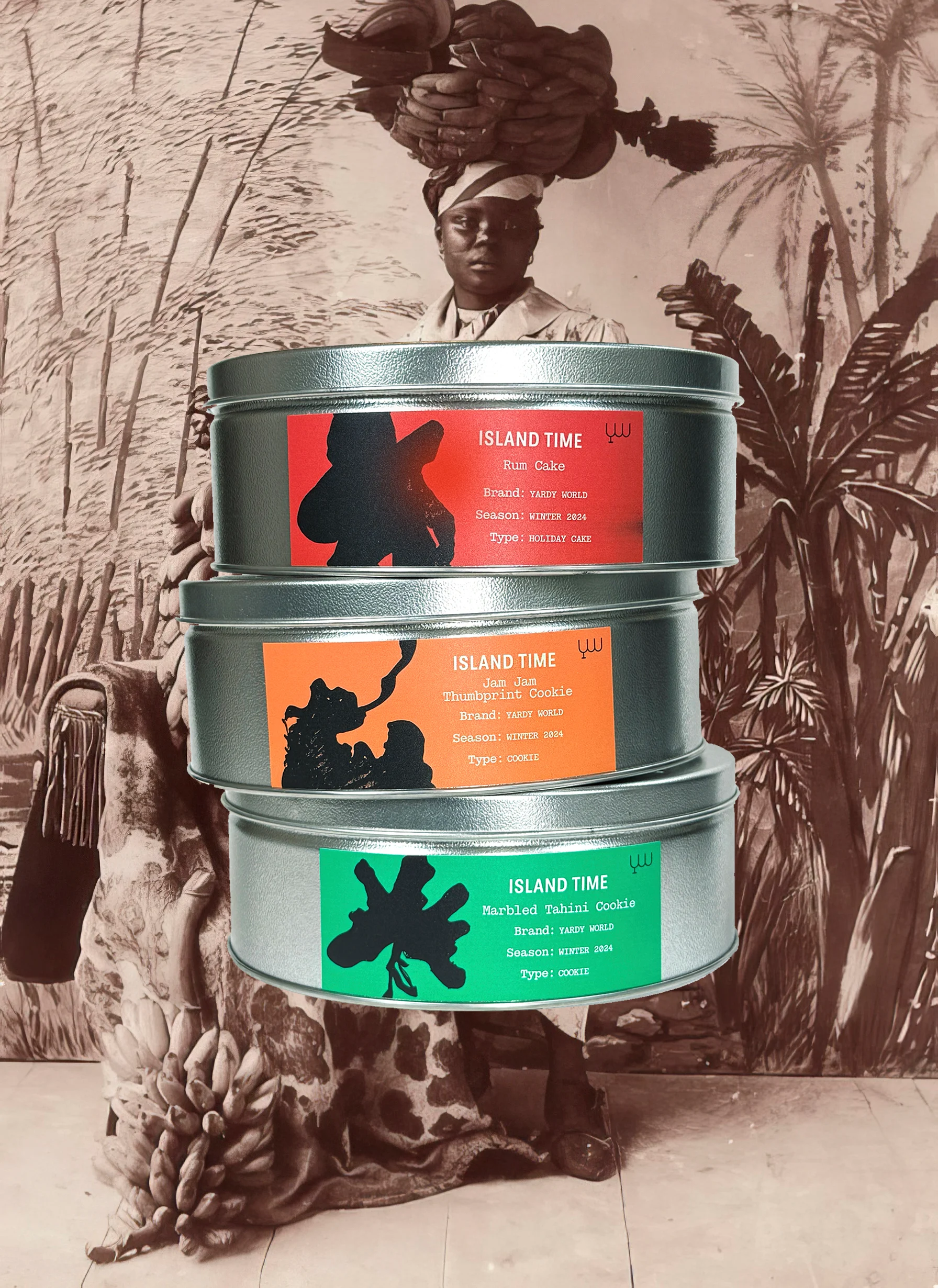
a project by independent cook DeVonn Francis, rooted in Caribbean food culture and storytelling. Working closely with DeVonn, Troy designed a brand identity for Island Time, a limited-edition tin set created for the holiday season. Each tin features a unique recipe crafted by DeVonn, with packaging that reflects the warmth and vibrancy of his culinary perspective. As the series evolves, Island Time will continue to mark special occasions with new flavors and designs.

Role: Brand Design + Packaging Design

In Collaboration with: DeVonn Francis

Year: 2024-25
Yardy Wolrd: Island Time: Special Edition tin packaging design

Suzanne Lacy at Queens Museum

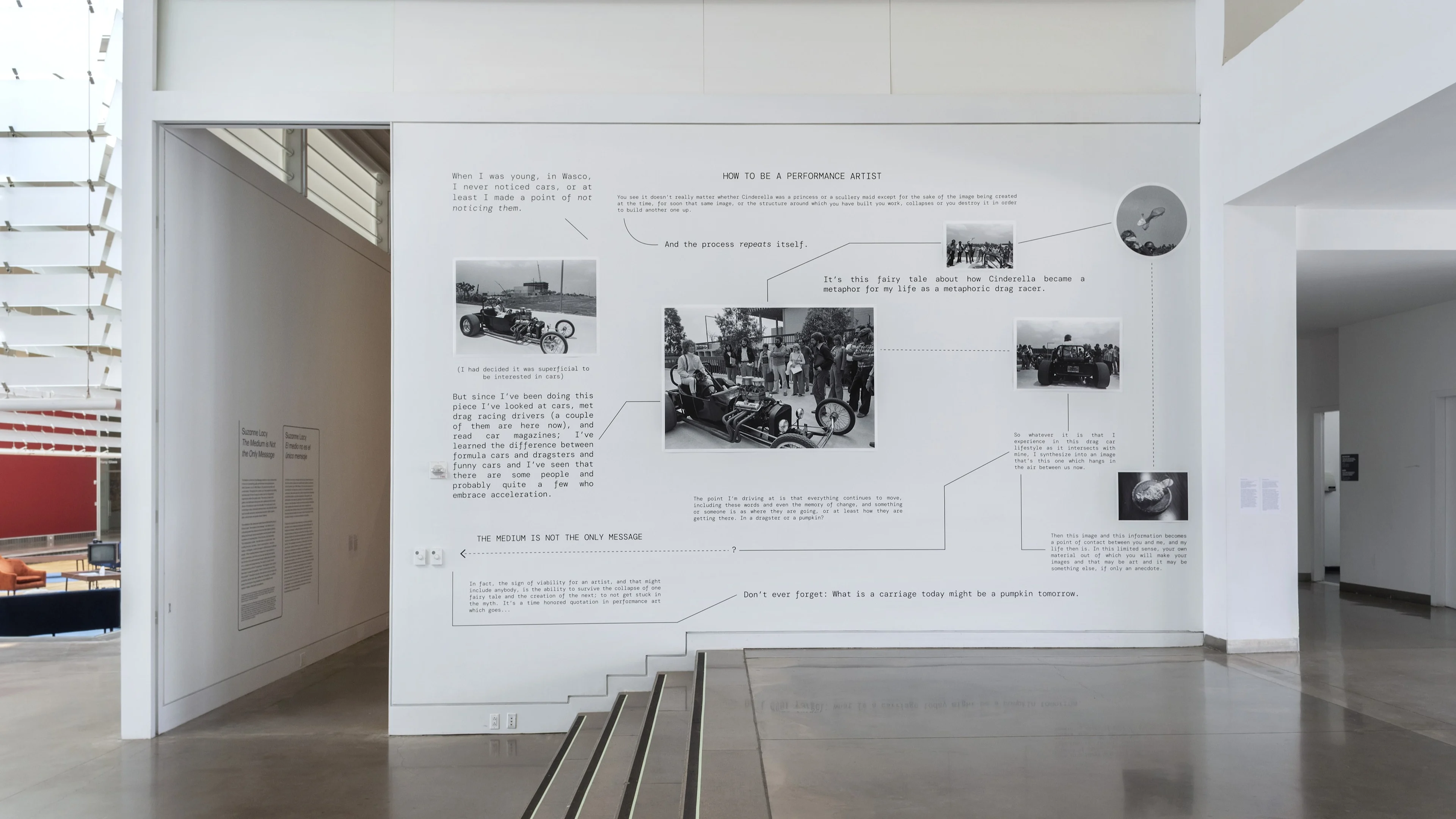
Exhibition design for Suzanne Lacy’s solo exhibition at the Queens Museum, titled; ‘The Medium is Not the Only Message’ (March 13-August 14, 2022). I worked closely with Suzanne to help design the documentation wall of her performance ‘Cinderella in a Dragster (How to Be a Performance Artist)," 1976/2022, vinyl text and giclee prints.

The installation is based on documentary photos and the original performance script. Dressed in a helmet and yellow jumpsuit, Lacy performed a rapid-fire monologue on the twists and turns of her own life’s trajectory from the driver’s seat of a drag car.

Intermingling the remarkable and the banal, Lacy’s speech invokes the story of Cinderella as a metaphor for survival as an artist (and as a human being).

Image courtesy of Queens Museum, credit: Hai Zhang.

Role: Art Direction & Design

In Collaboration with: Suzanne Lacy and the Queens Museum staff.

Year: 2022

'Cinderella in a Dragster (How to Be a Performance Artist)' by Suzanne Lacy, 1976/2022. Vinyl text and giclee prints. At the Queens Museum. Photo credit: Hai Zhang.

Stranger's Arms

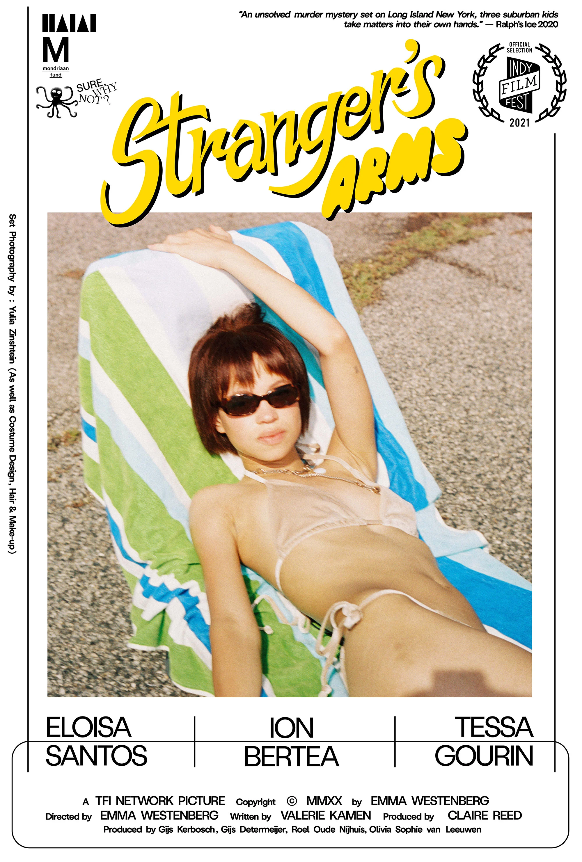
Film title, credits and poster design for an independent feature length film, Stranger's Arms. Directed by Emma Westenberg and written by Valerie Kamen. Set photography by Yulia Zinshtein. The film takes place on Long Island New York, 3 suburban kids investigate an unsolved murder mystery. The film screened at Indy Film Felstival 2021. The title design was inspired by Ralphs Famous Italian Ice's.

Role: Art Direction & Design

In Collaboration with: Carolina Festa (Letterform Refinement)

Year: 2021

strangers arms emma westenberg film title credits sequence graphic design long island new york
Poster design
Poster design

BZippy

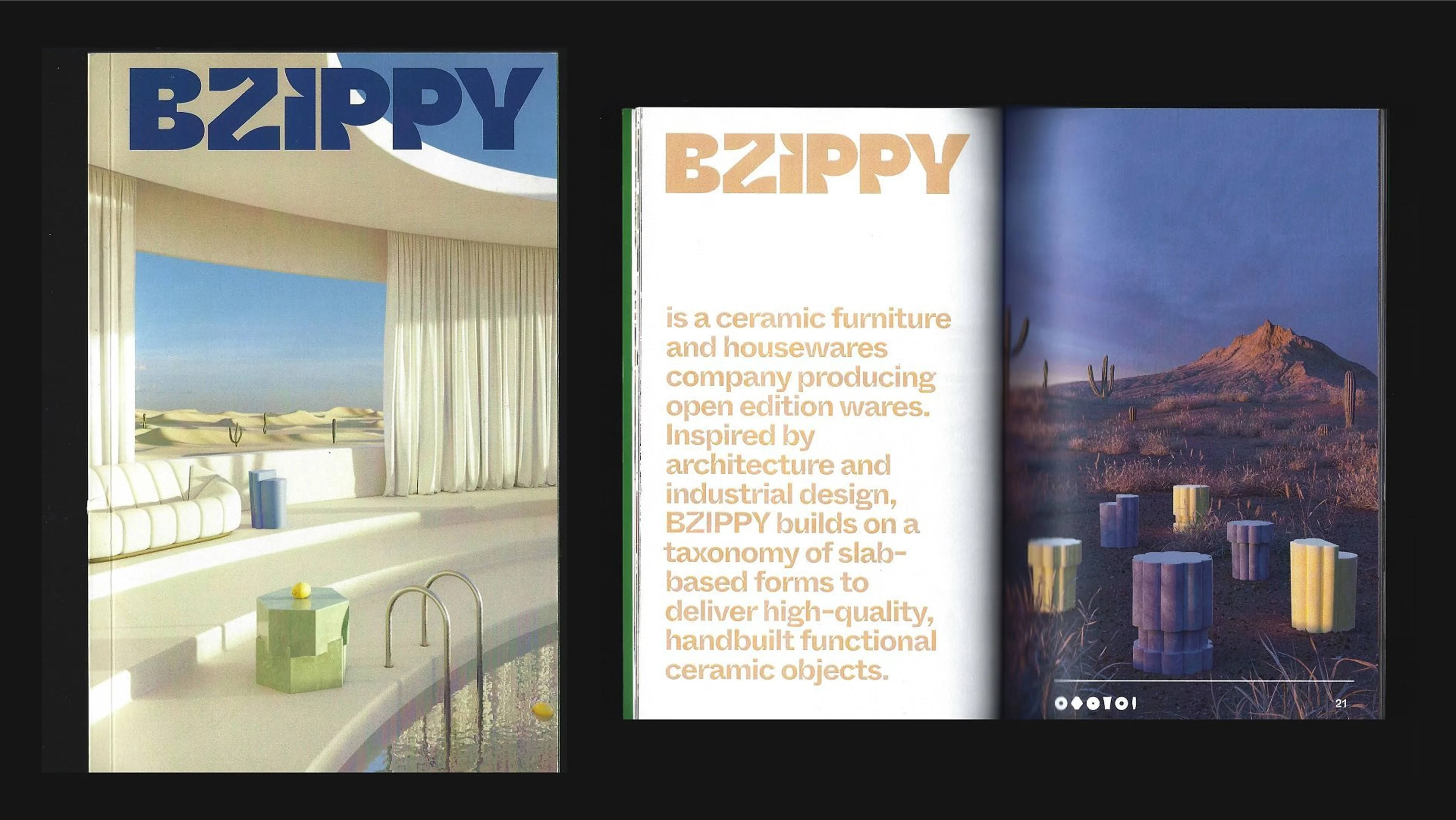
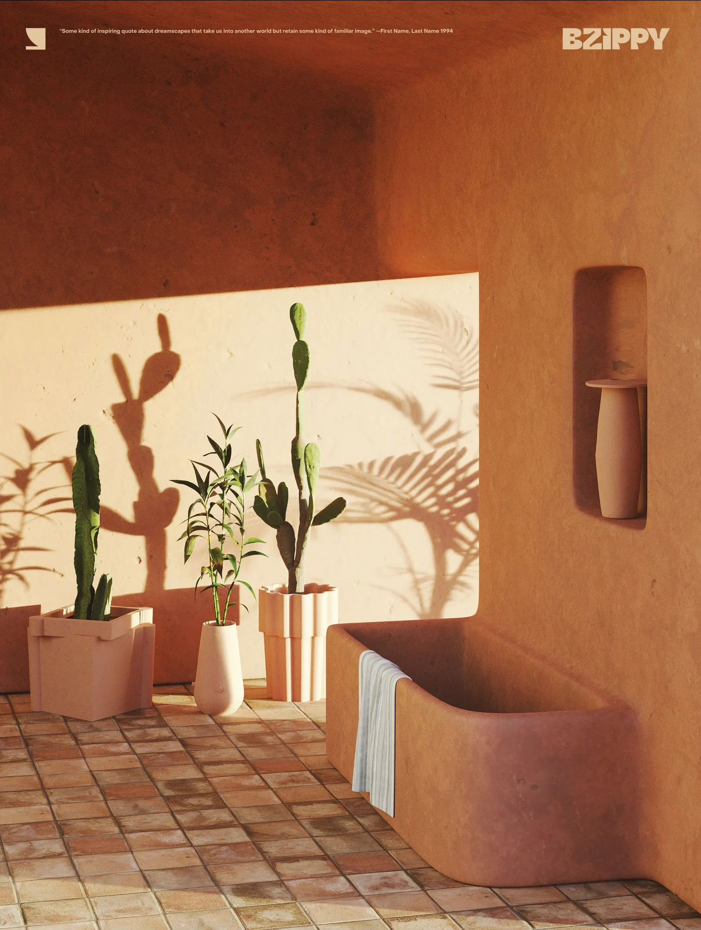
an LA-based fine ceramics studio that produces iconic handmade objects and furniture. Working closely with Bari Ziperstein, the founder of BZippy, we helped usher in a new brand identity that better represents the tenacity of the studios work. We redesigned BZippy's logotype and provided a new symbol to accompany the brands new identity.

Role: Creative Direction and Design

Studio: Silk

In Collaboration with: Cristala Andrews (Art Direction and Design)

Year: 2020

BZippy Lookbook
BZippy Lookbook
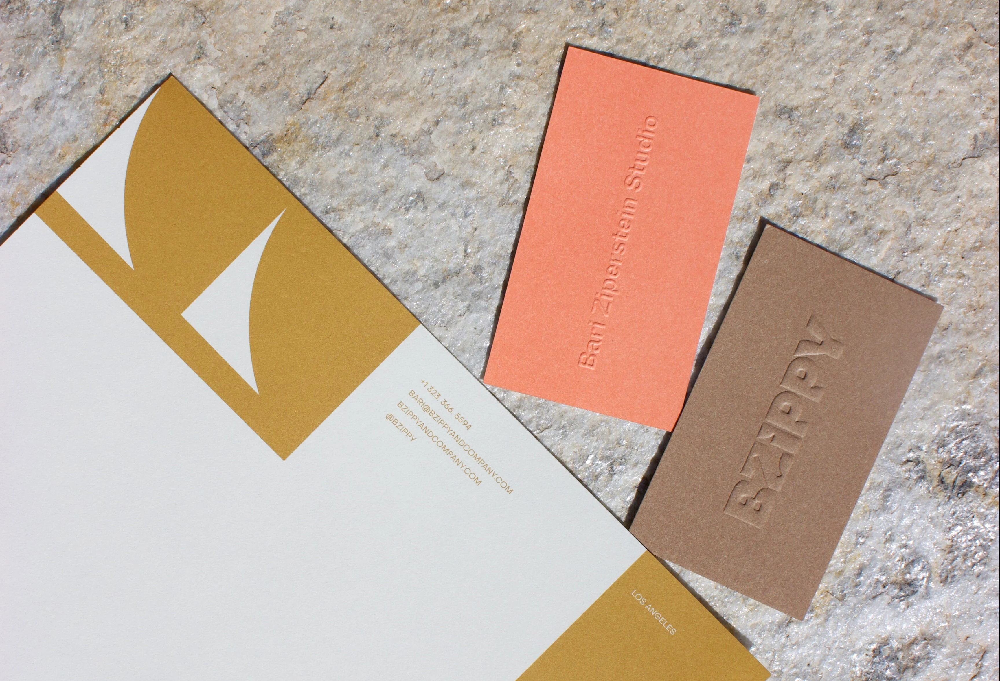
Stationery designed in collaboration with Cristala Andrews. Photo by Cristala Andrews.
Poster design series. Digital rendering by Charlotte Taylor and Victor Roussel.

The Bohen Foundation

The Bohen Foundation “operates under the sign of transition,” with output untethered to any singular telos or form. The Bohen Foundation doesn’t have a permanent collection, they are non-possessive by design, true art patrons that help artists realize significant bodies of work. Operating both in New York and Aspen, they have supported contemporary artists, independent organizations, and visual culture. Informed by their previous projects and history as an institution, Troy Kreiner art directed and designed their website and a publication to showcase their enormous archive of past projects.

Visit the Bohen Foundation's website here.

Role: Art Direction and Design

Studio: Use All Five

In Collaboration with: Christine Jackson (Art Direction and Design) and Isaac Ruiz (Design)

Year: 2017

Inside cover design of a self-published book documenting decades of the Bohen Foundation's art patronage.
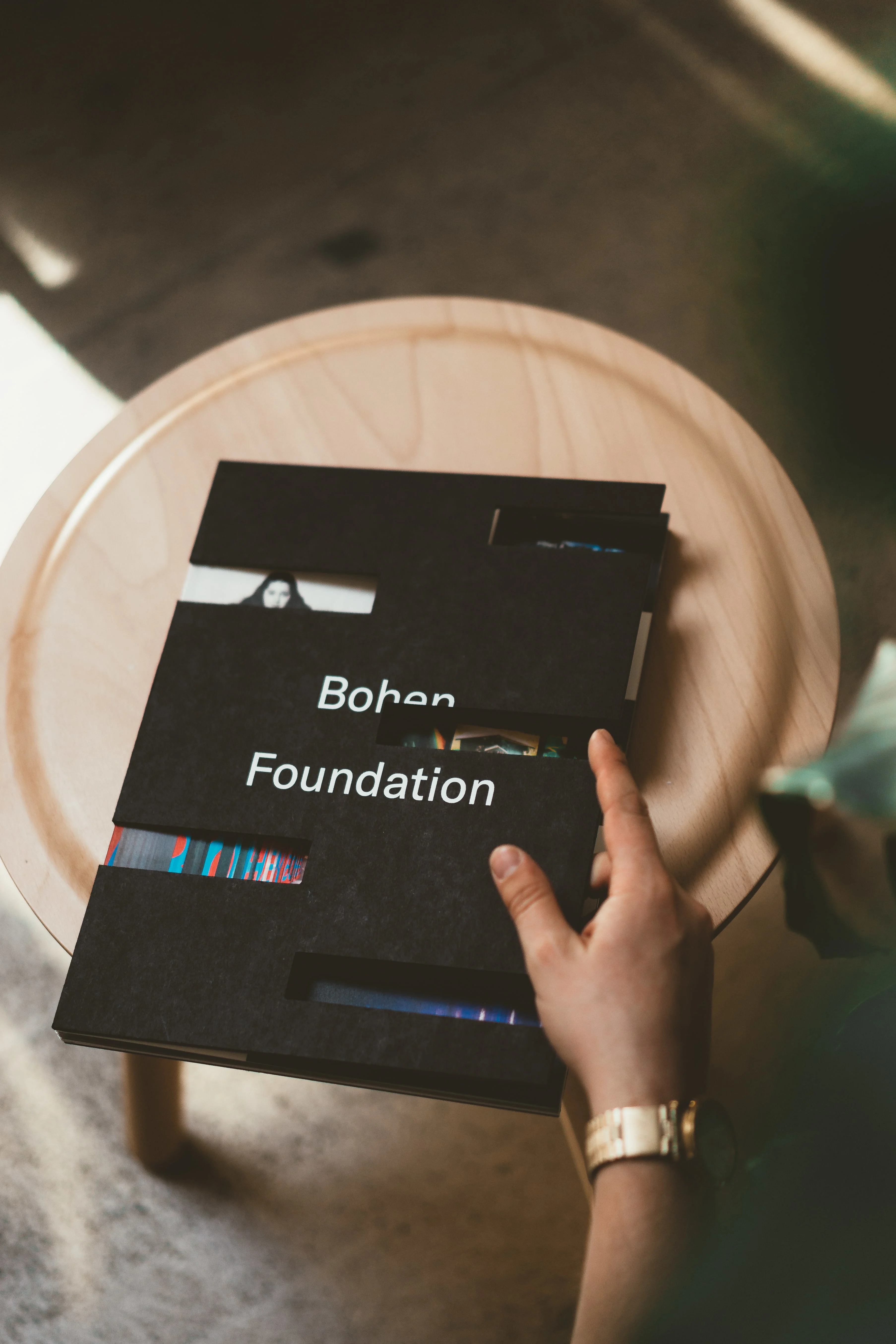
Front cover design; die-cuts revealing the inside contents of the book.
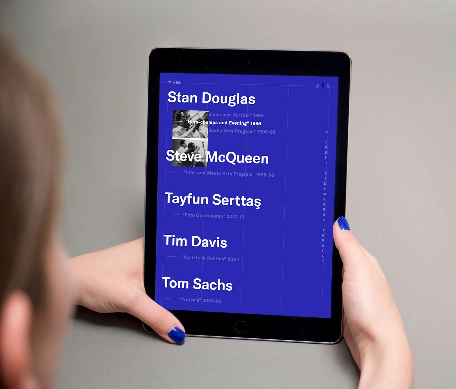
Website design : Tablet documentation showcasing the list view of all the artists The Bohen Foundation has worked with.
Custom loader and easter egg on the website.
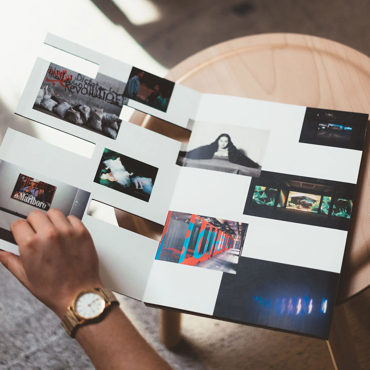
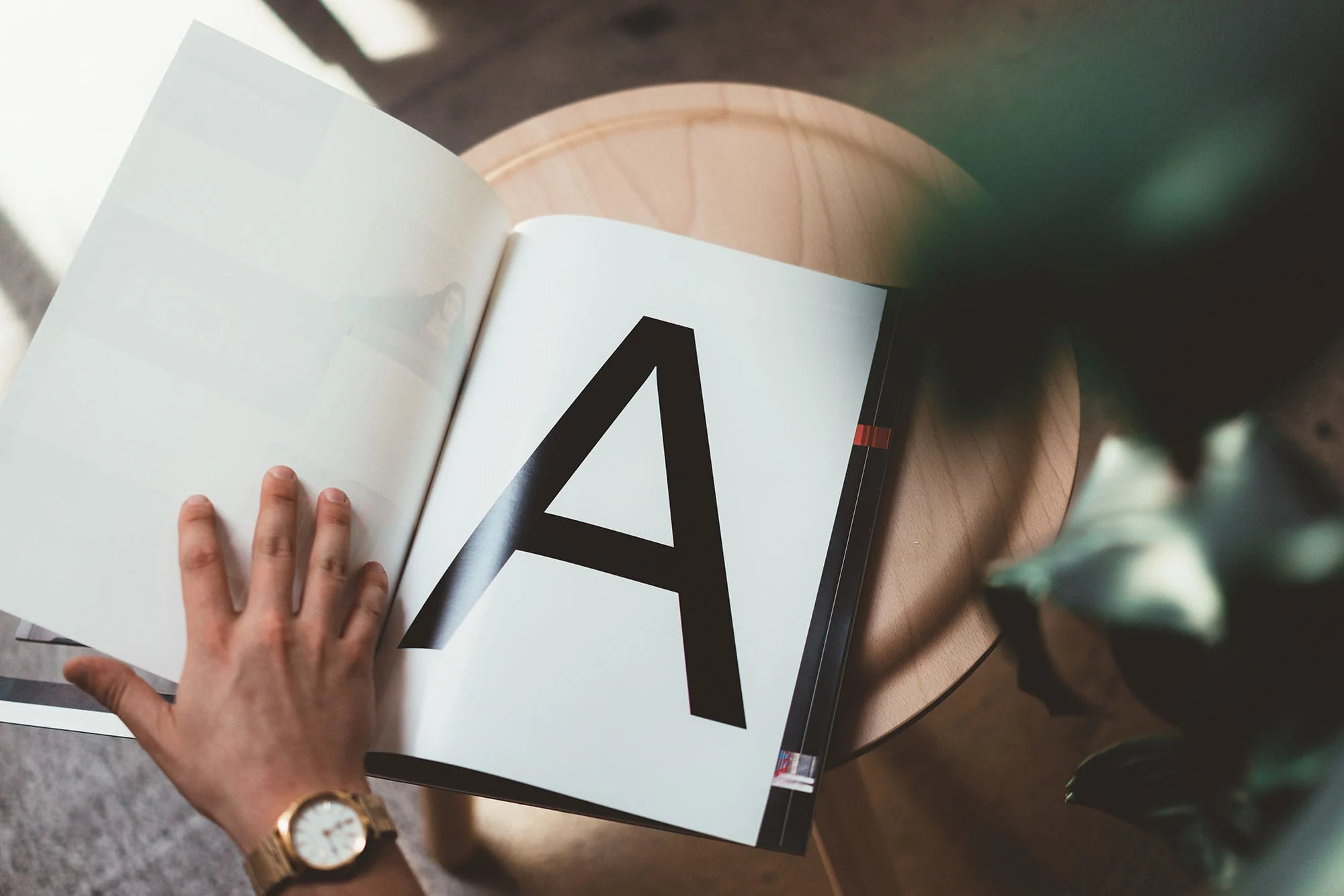
Inside detail of the book, Section A.
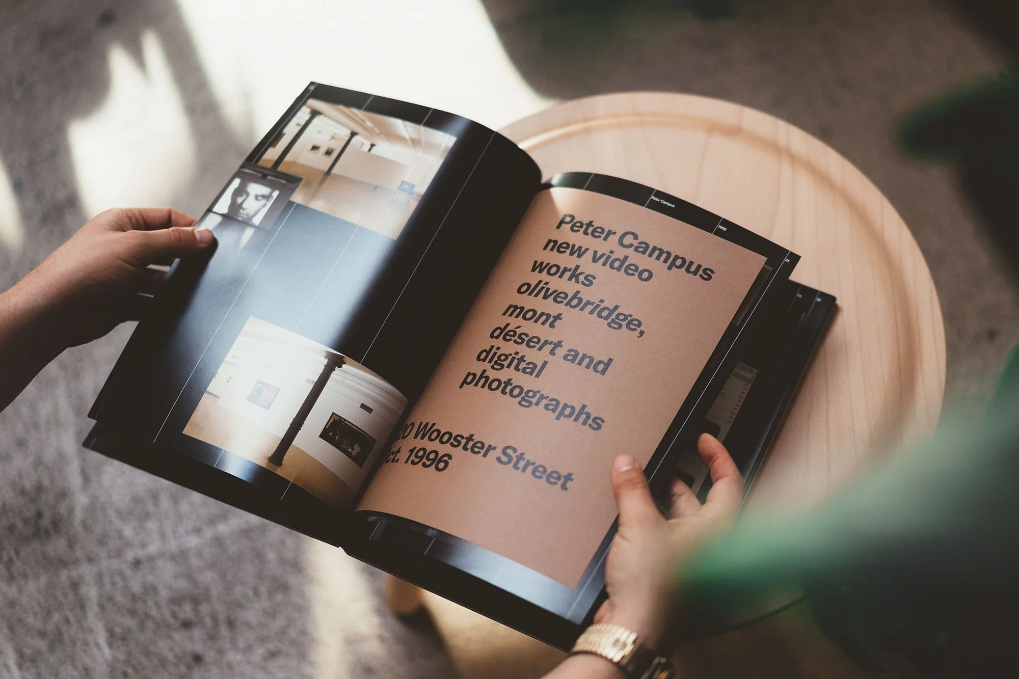
various tip-ins throughout the book functioning as project title pages and overviews.
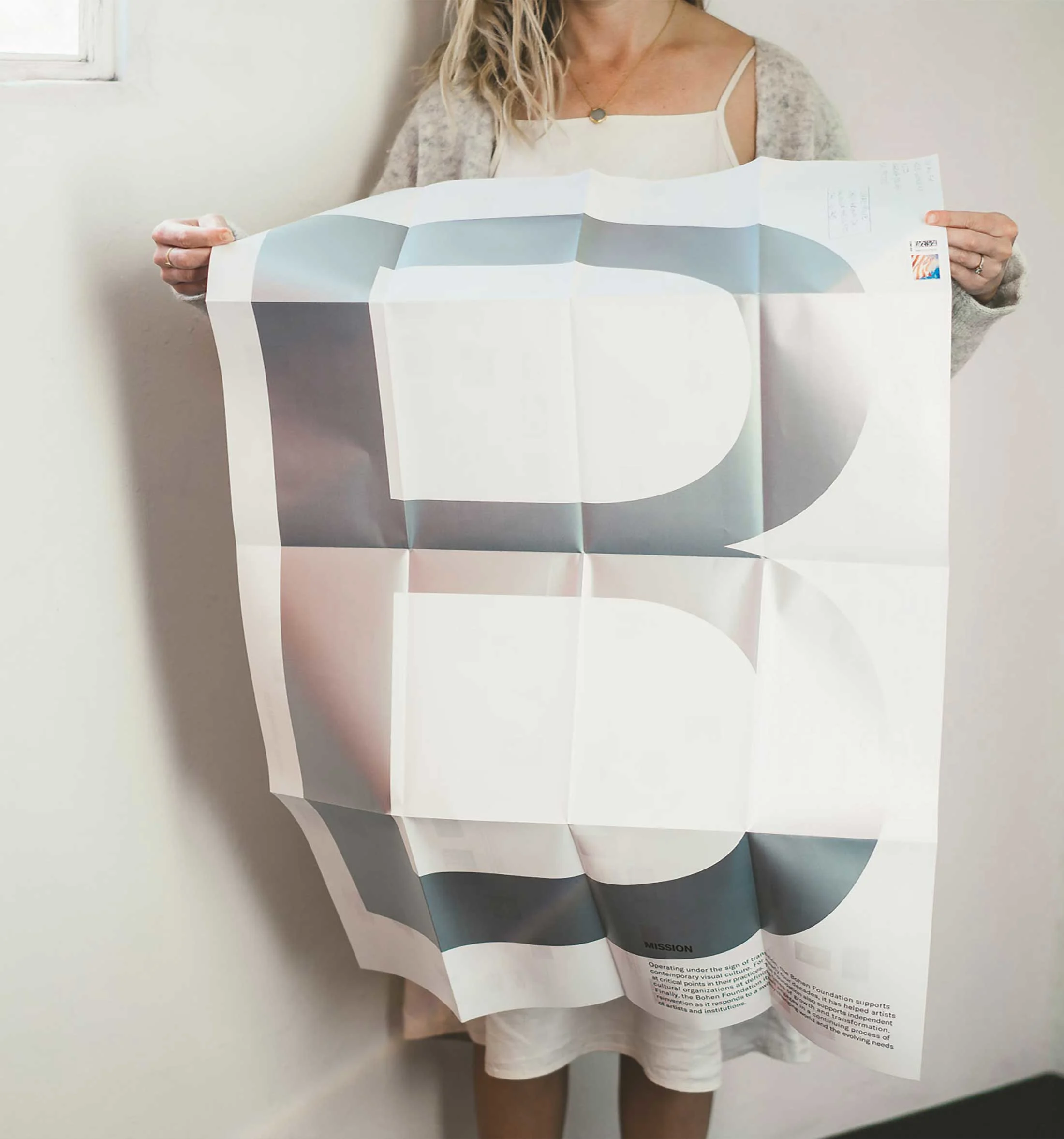
a fold-out mailable poster with a full timeline of all Bohen related projects
Website for The Bohen Foundation.

Ways of Curating: Hans Ulrich Obrist

Working closely with Google Arts & Culture, ForYourArt, and curator Hans Ulrich Obrist to help design and develop a platform that explores Obrist’s journey from contemporary art into an expanded field of various disciplines including architecture, literature, philosophy, and science.

As the preeminent curator of the information age, Obrist’s curatorial work has defined and redefined the increasingly ubiquitous buzzword, curating. This project illuminates how Obrist — more than a historian, expert, or tastemaker — performs the distinct functions of a curator. Ways of Curating helps visualize and connect larger thematic ideas that run through his years of curating.

See the website here.

Role: Art Direction

Studio: Use All Five

In Collaboration with: Ben Kasum (Art Direction and Design), Christine Jackson (Design), and Justin Kielbasa (Design)

Year: 2017

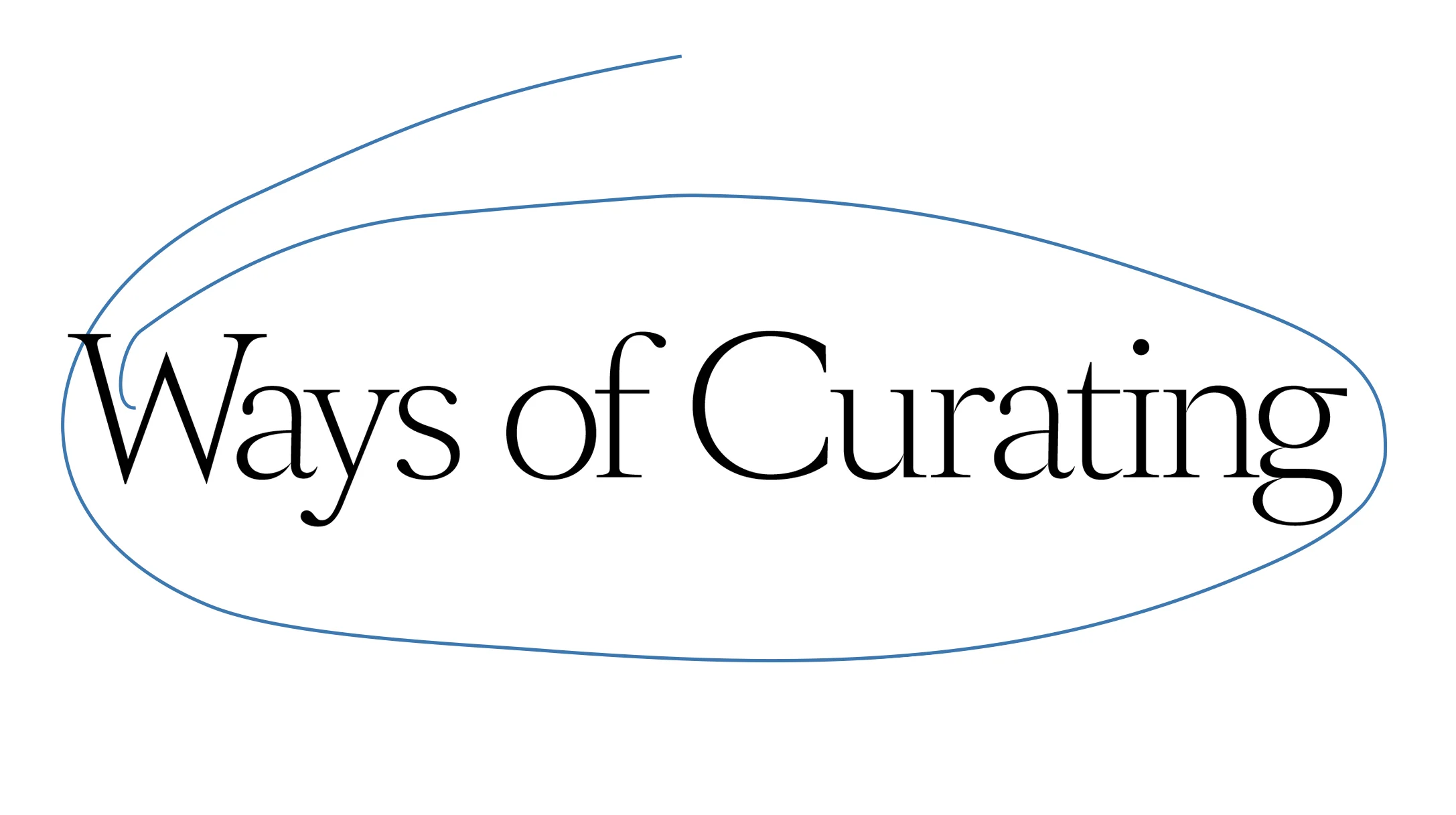
Logotype and visual identity for Hans Ulrich Obrist's archival website
Website Developed by Use All Five
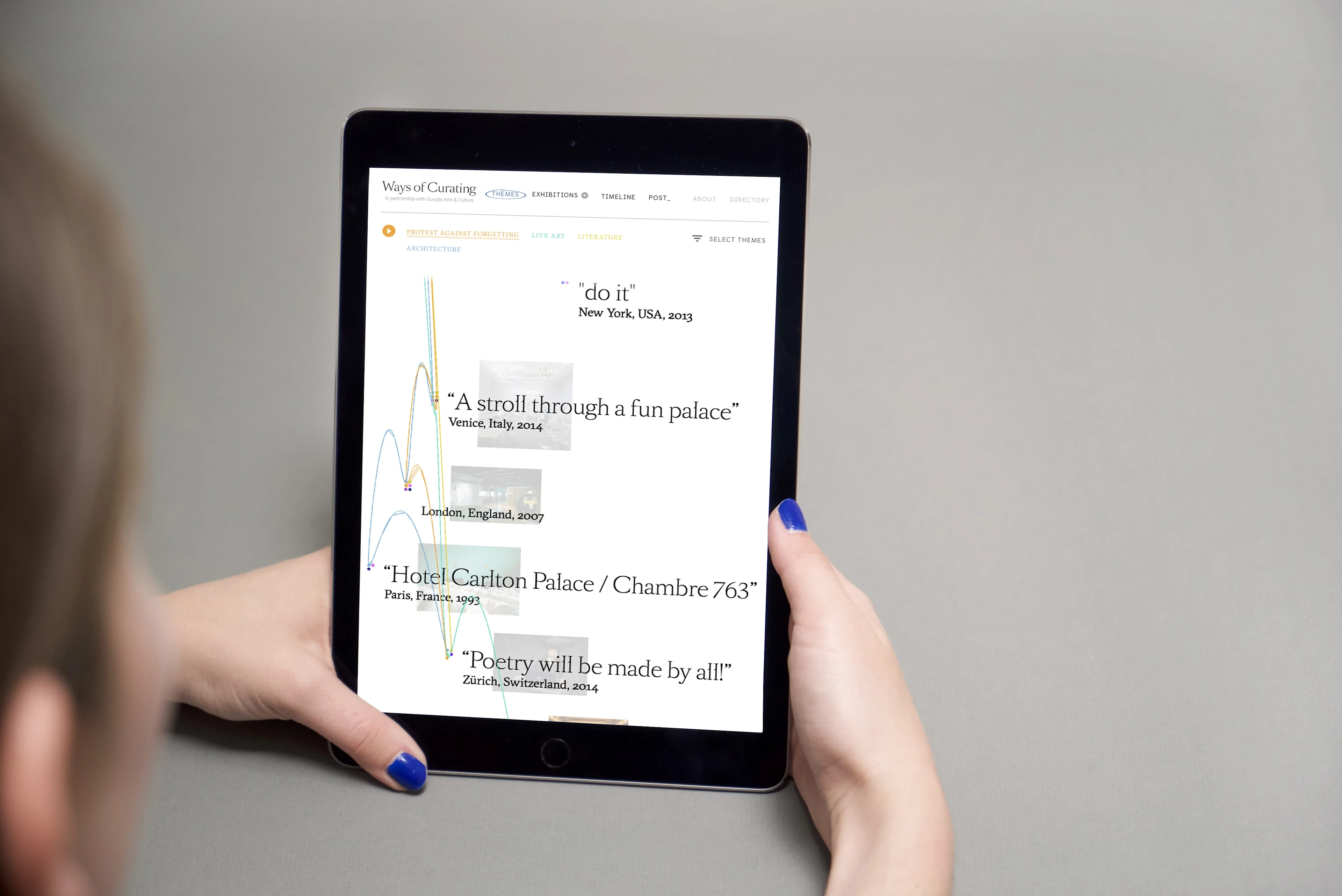
Tablet view of the Exhibitions page
documentation of the 'Themes' page, illustrating larger thematic connections between Obrist's curatorial work
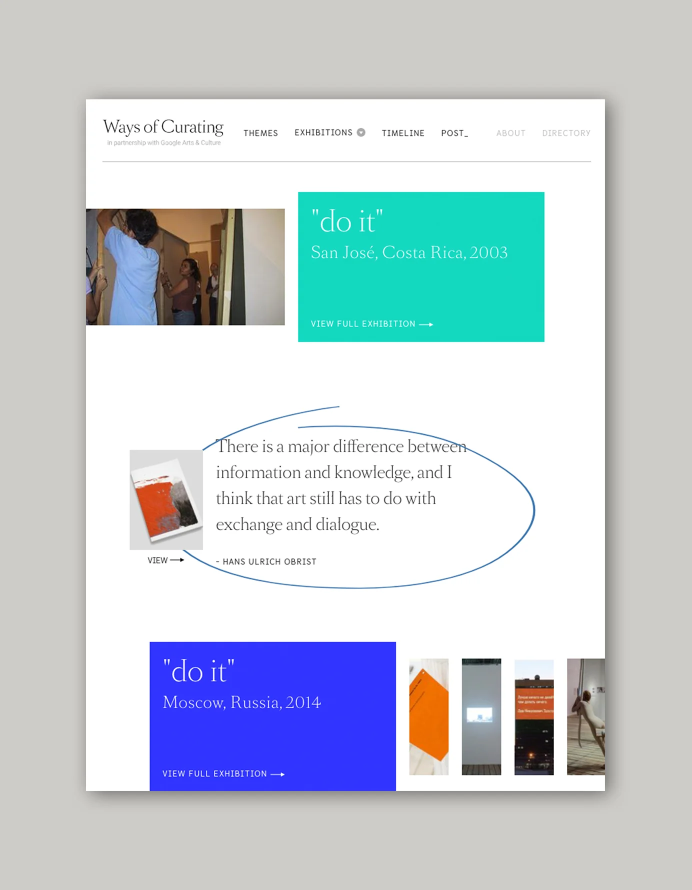
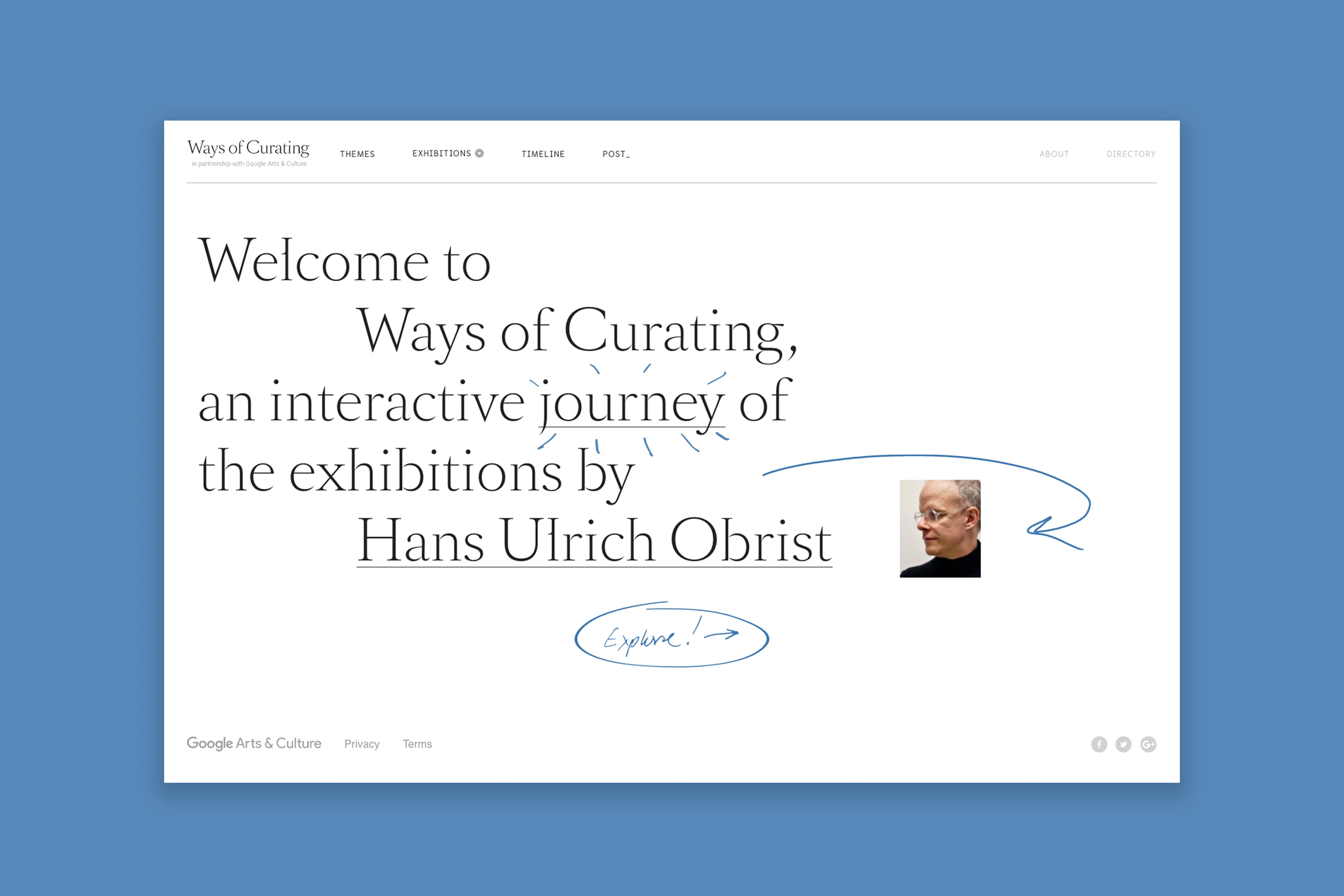
Desktop landing page of the Ways of Curating website
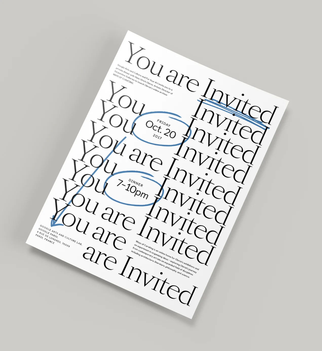
Private invitation to the launch event for the Ways of Curating website.

The Main Museum

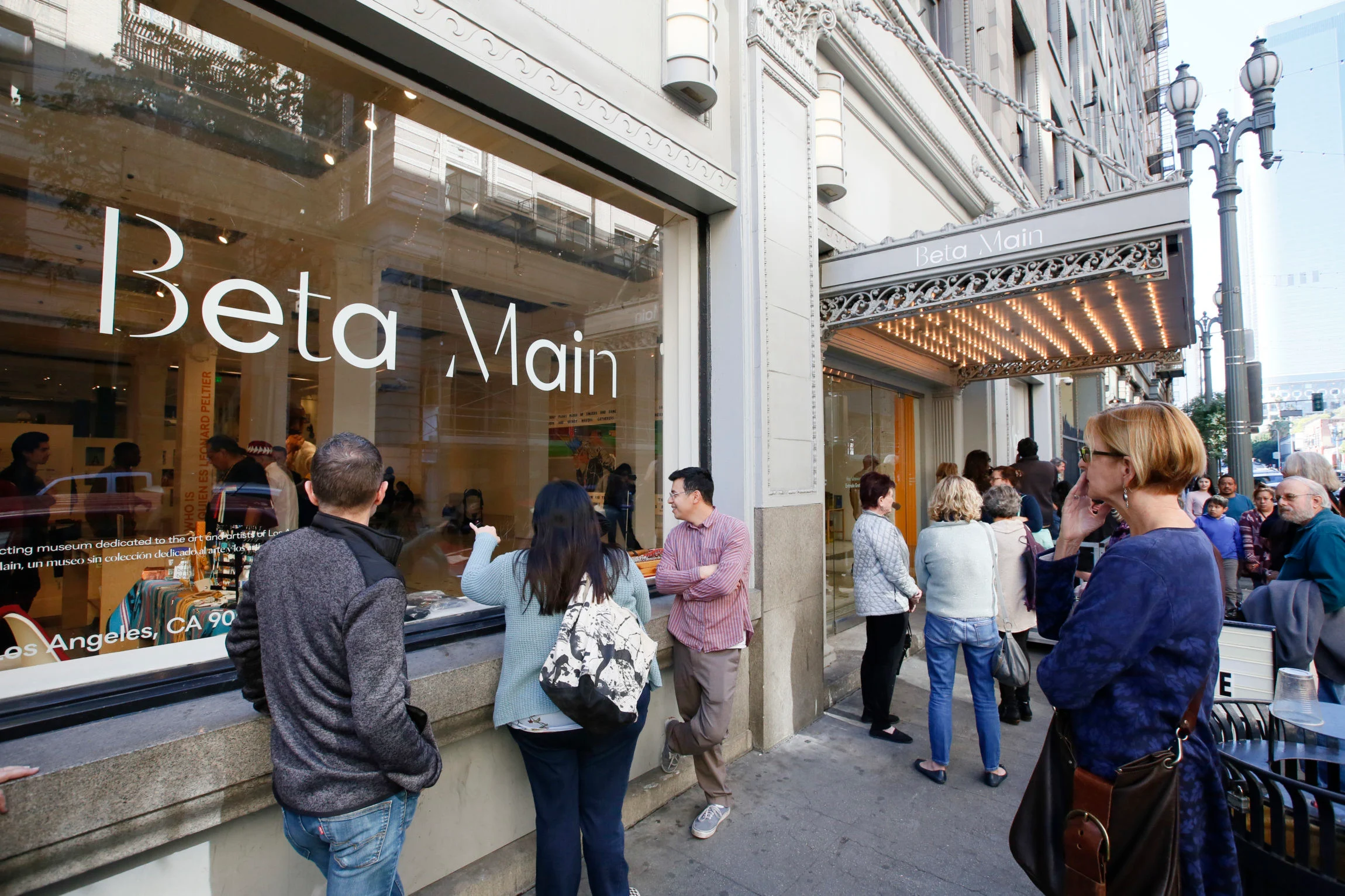
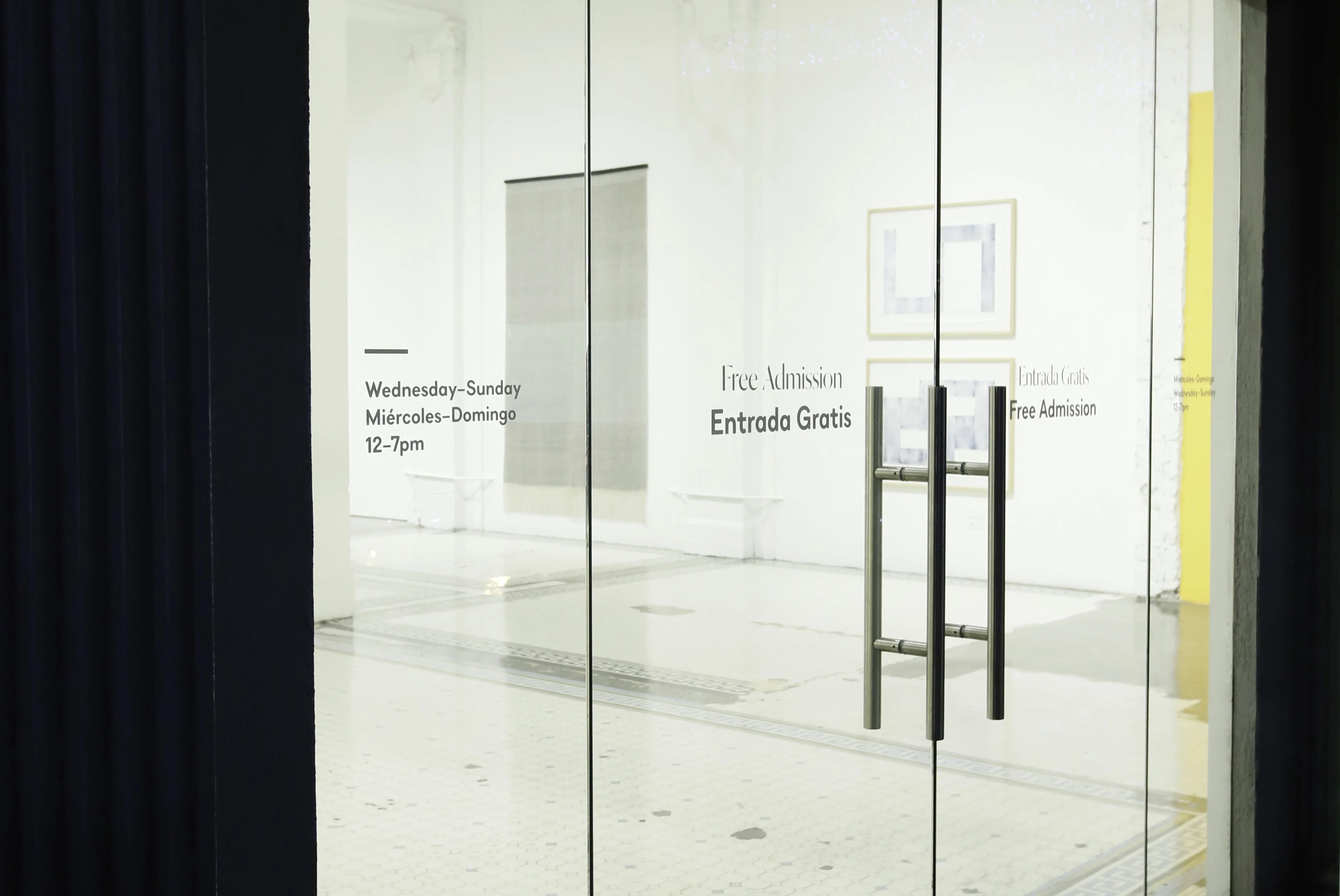
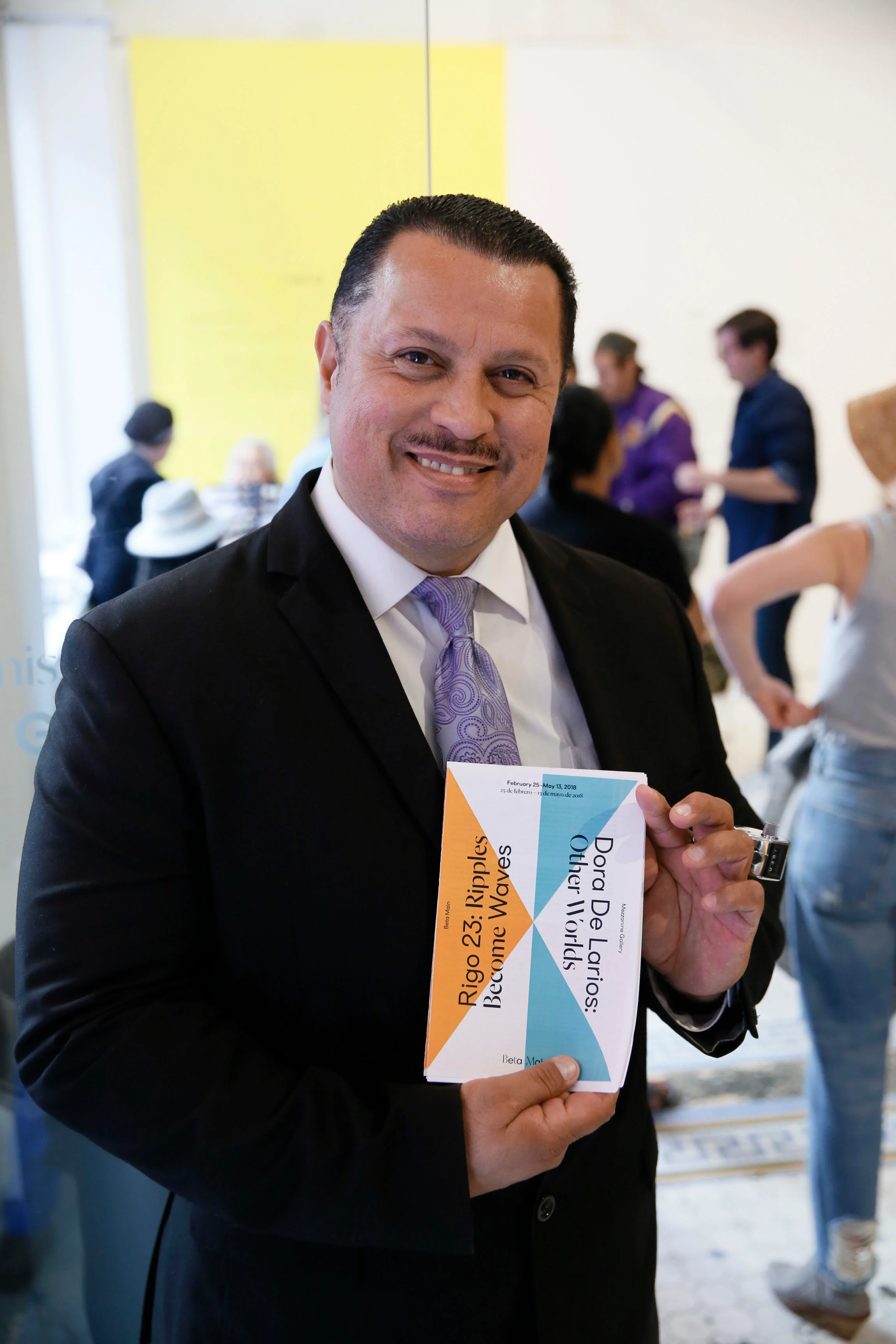
The new visual identity for the Main Museum in downtown LA sought to reflect the bilingualism of Los Angeles and the museum’s mission of comitance for immersion within the city.

Described as a testing-site, embracing the institution’s experimental spirit a logotype was designed to convey the ongoing nature and process of experimentation. By leaving distinct letterforms incomplete — a visual motif for a work-in-progress or the unfinished— the sense of creation and dynamism was rendered an intrinsic element of the institution itself.

Role: Art Direction & Design

Studio: Use All Five

In Collaboration with: Christine Jackson (Design), Mindy Nguyen (Art Direction and Design), Yuji Sakuma (Creative Direction)

Year: 2017

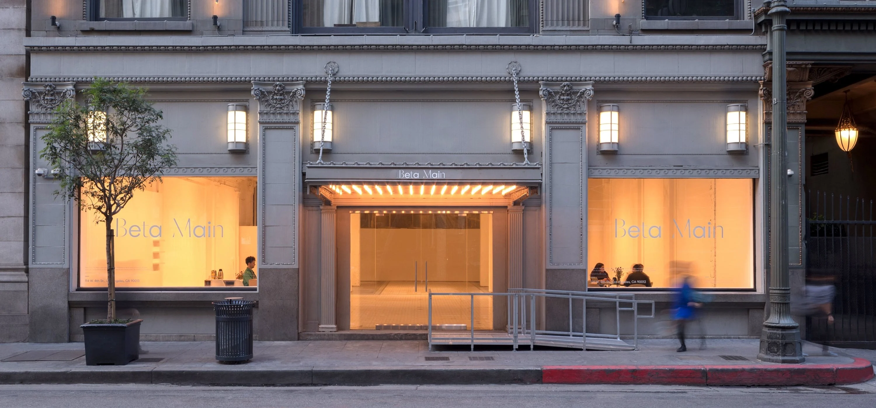
Storefront view of the new logo for Beta Main, located in downtown Los Angeles.
Storefront view of the brand identity design.
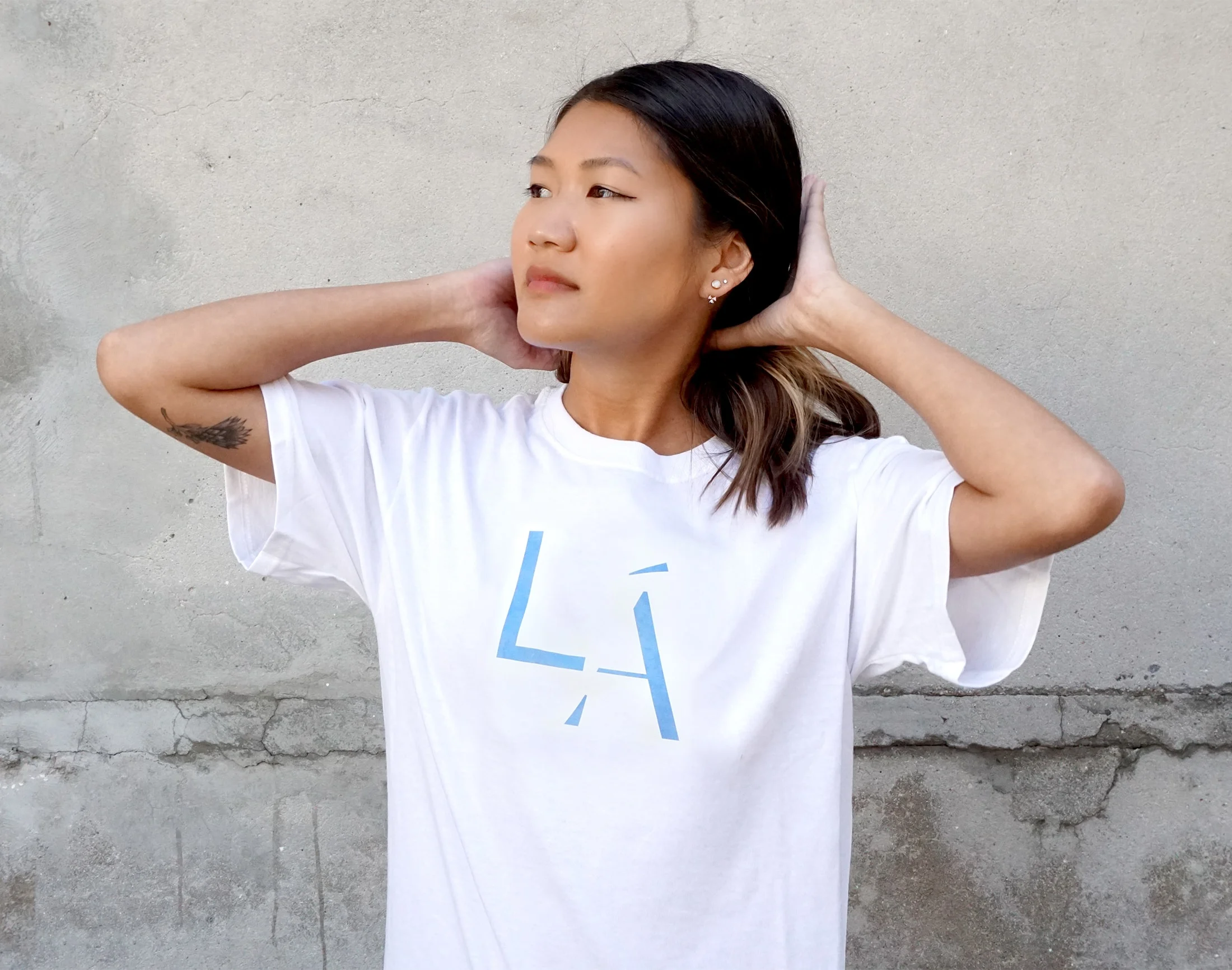
T-shirt design for the museum, indicated the bilingual nature of their identity.
Bi-lingual entrance door graphics
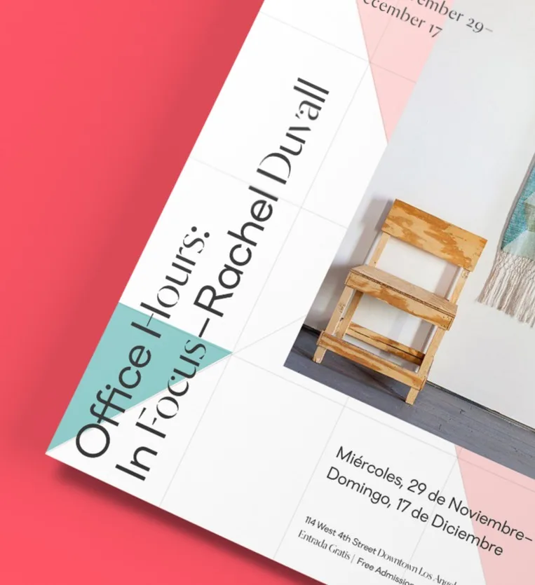
poster design detail
Logo reveal animation for The Main Museum.
Brand design applied to an exhibition flyer

UCLA Arts and Architecture

The UCLA School of the Arts and Architecture is a diverse family. The project was to completely redesign the visual identity of the school. The result was a new fluid identity system that would be applied across print and digital collateral.

The colon mark became a dynamic glyph used to to symbolize, and manifest, dialogue between the school’s various population, programs, and museums. Signifying ‘more to come’, the colon allows for a deeper rendering of an idea or a tool to attribute an idea to a speaker.

Role: Art Direction and Design

Studio: Use All Five

In Collaboration with: Christine Jackson (Art Direction and Design), Justin Kielbasa (Art Direction and Design)

Year: 2017

Animated logo lockups for the UCLA Arts visual identity.
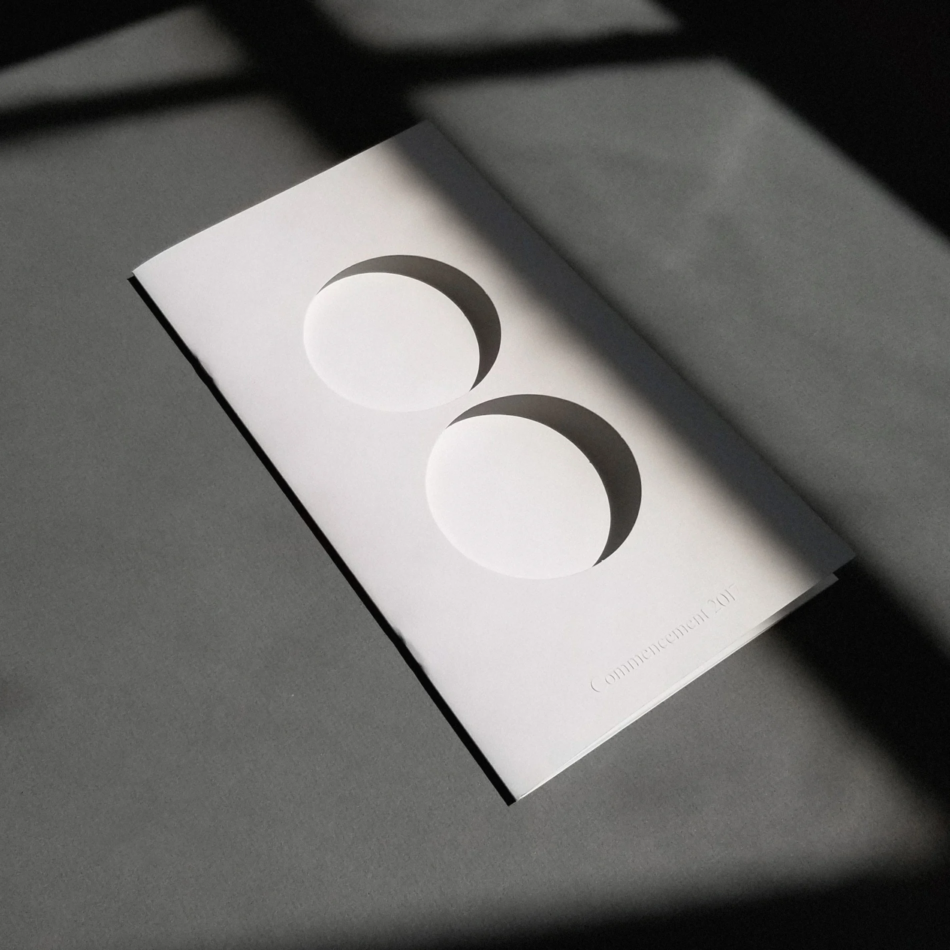
Commencement program design, in the center is a die-cut of UCLA Arts symbol, which reveals a featured artwork for each year.
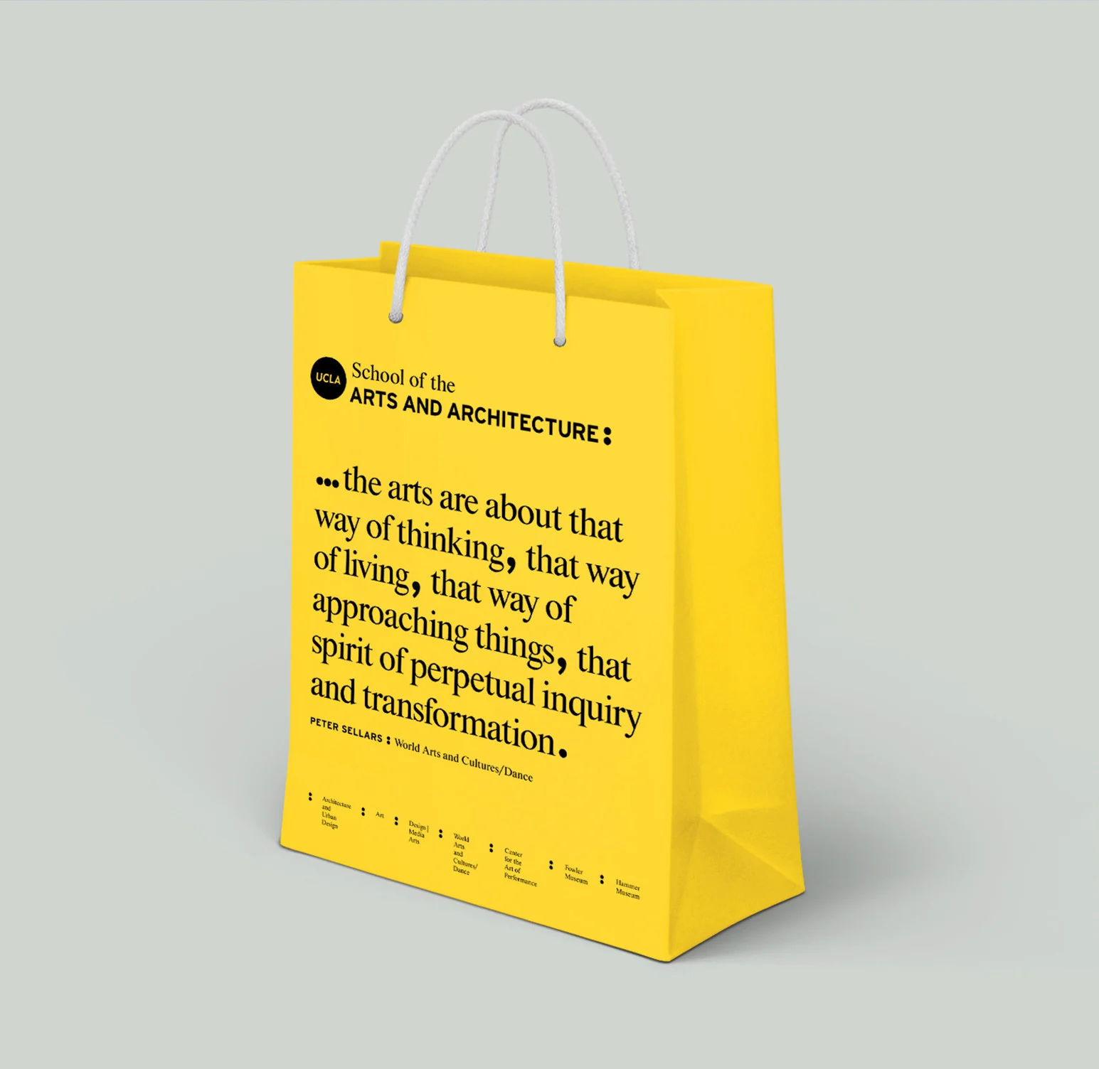
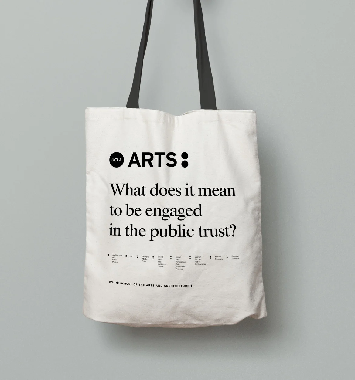
Gift bag design, featuring quotes from the full-time faculty.
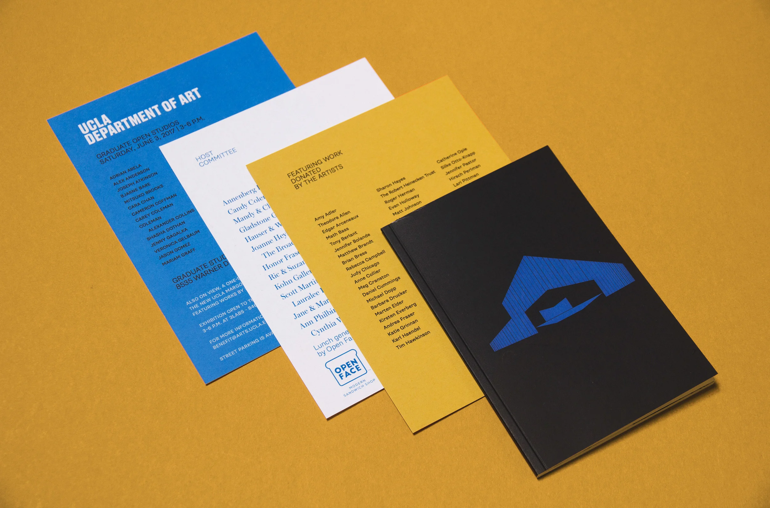
Collateral design for an Art Auction fundraiser.
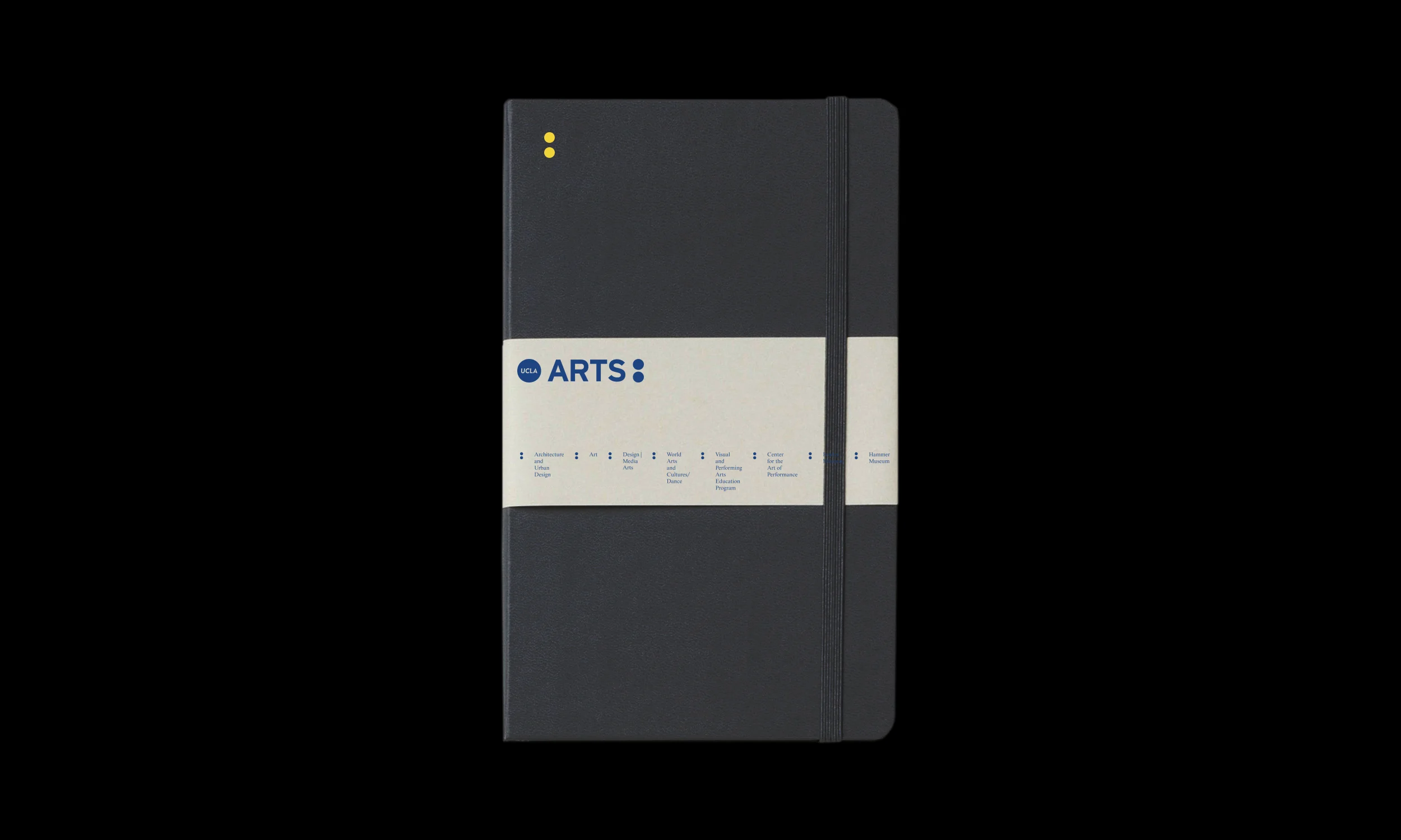
Black notebook with a UCLA Arts belly band, on black
Canvas tote printed with UCLA Arts and "What does it mean to be engaged in the public trust?"
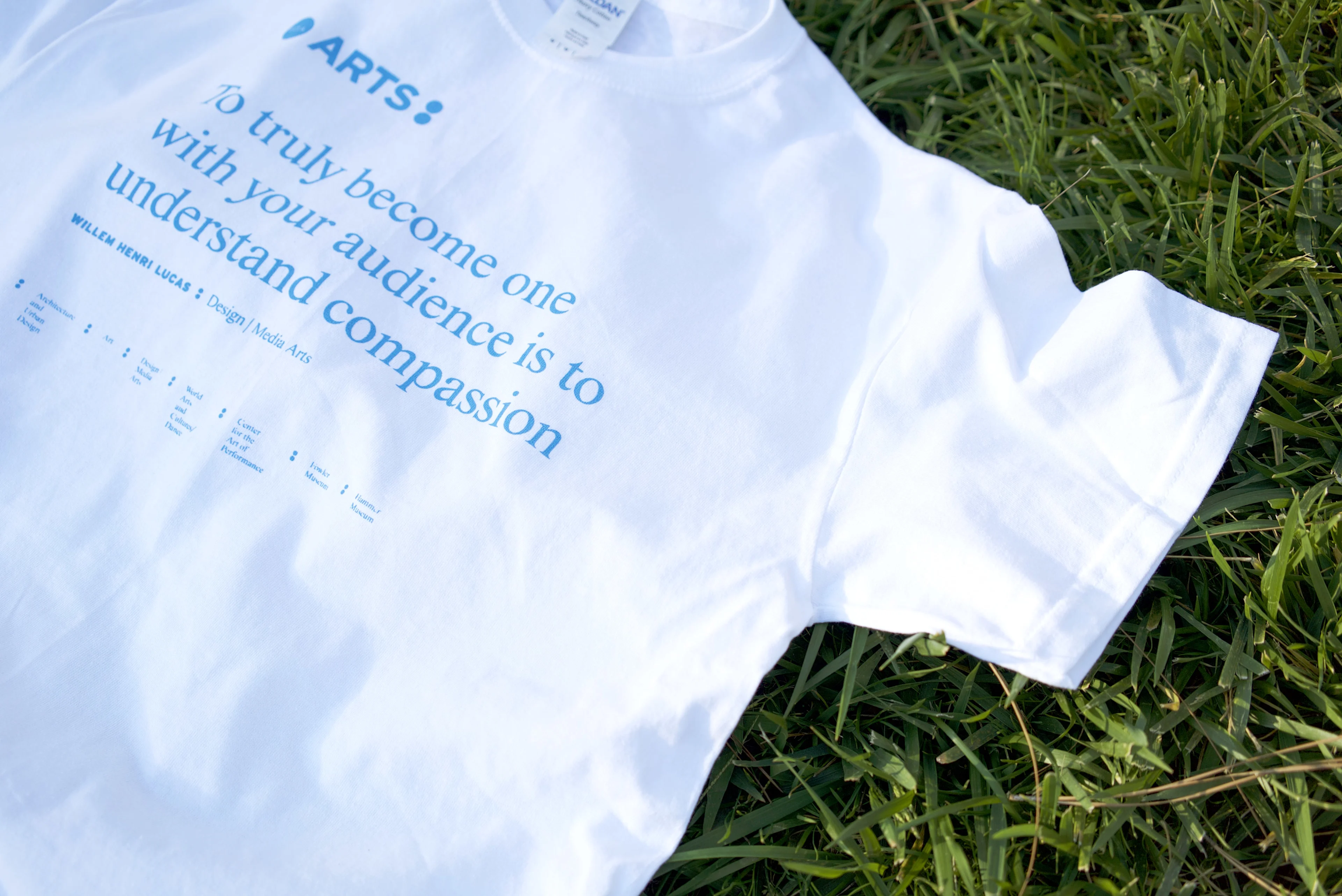
White UCLA Arts t-shirt on grass with a blue printed quote about understanding compassion
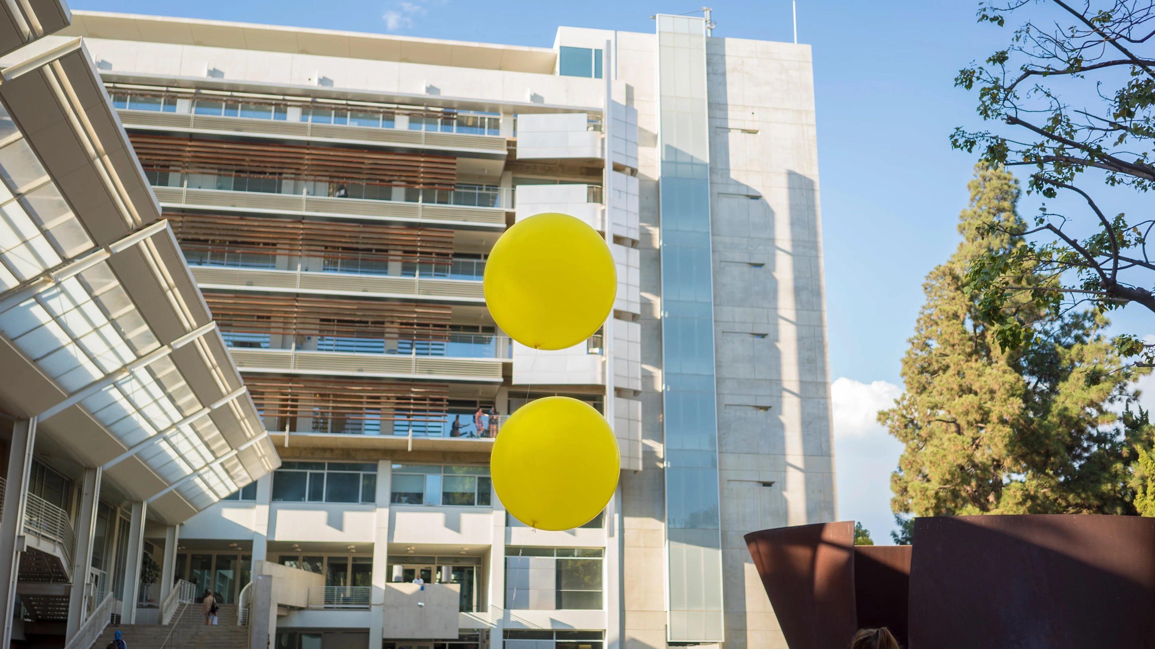
Iconic yellow balloons arranged as a colon, used for special events on campus.

Guggenheim: Storylines

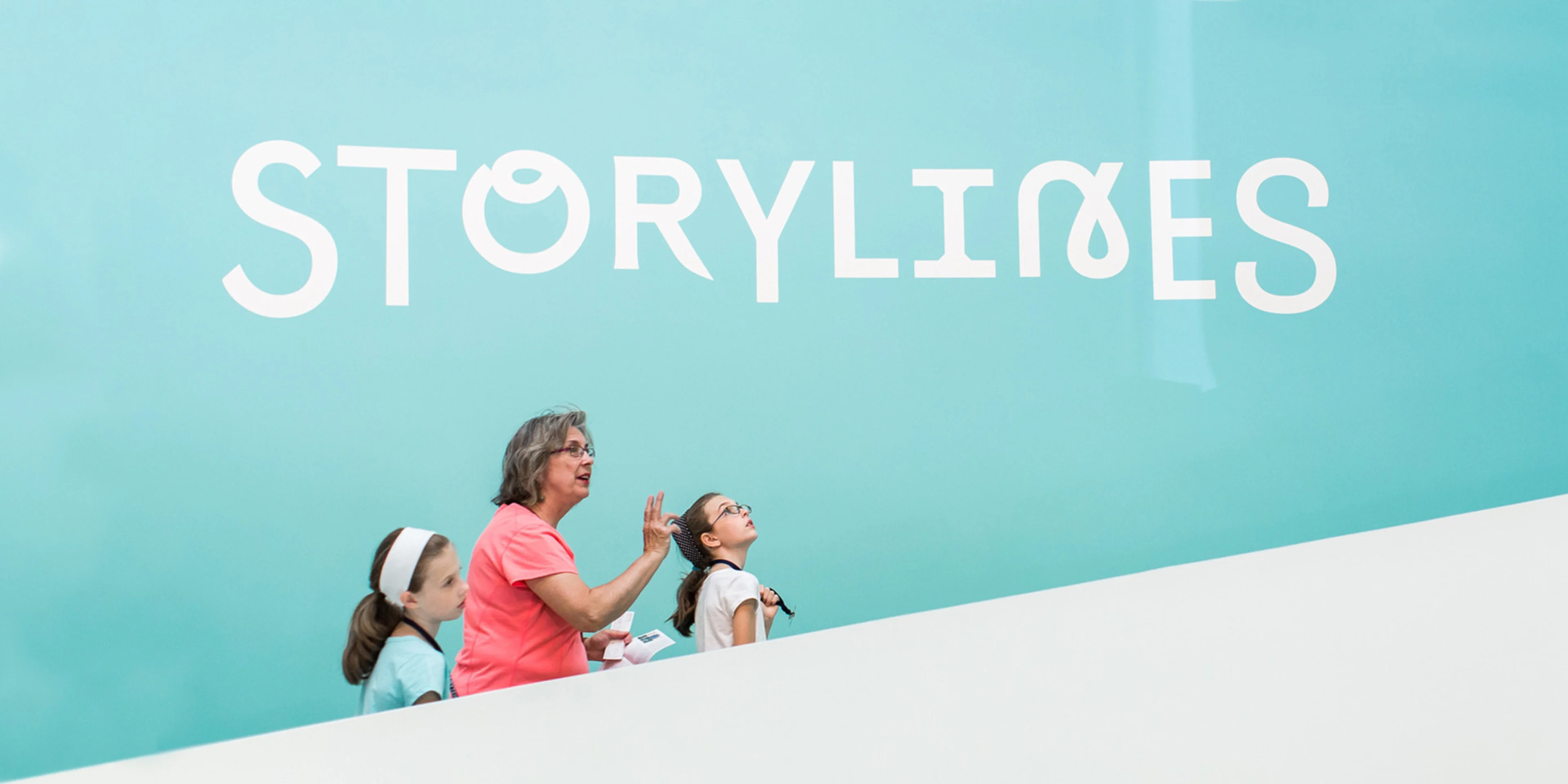
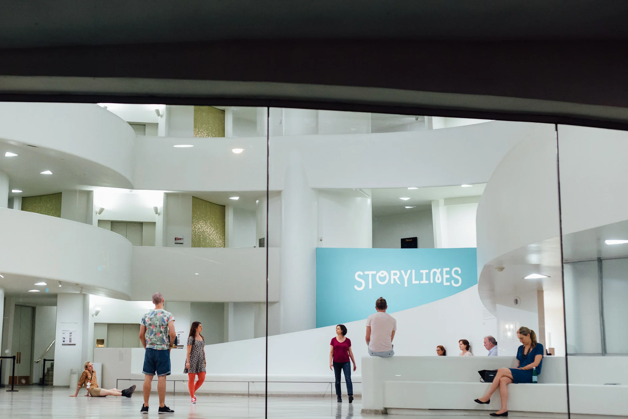
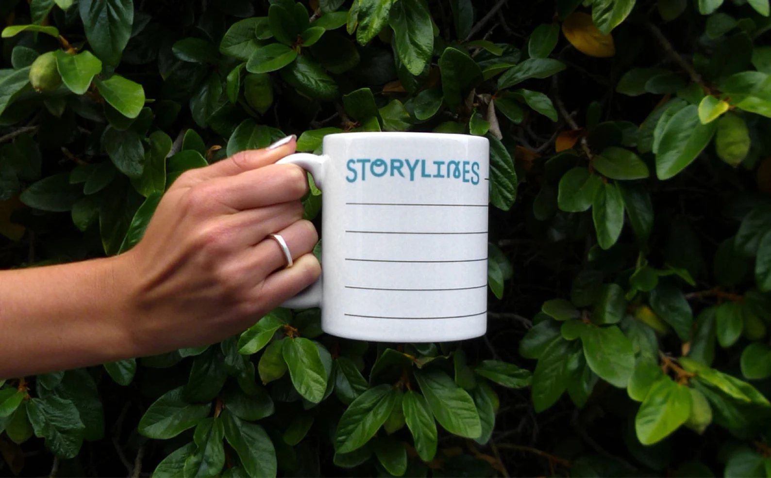
Storylines (2015) was an exhibition at the Guggenheim Museum featuring 100 works by international artists amongst inspiring texts by 31 revered authors. The project was to digitize the exhibition so that it could exist as a interactive microsite that could be visited as a supplement to the physical exhibition. The digital experience and exhibition branding reflected the spirit and themes of its physical counterpart, by revealing the interconnected themes among the artworks.

Vist the website.

Role: Art Direction & Design

Studio: Use All Five

In Collaboration with: Christine Jackson (Design) and Justin Kielbasa (Design)

Year: 2015

Title design for their summer exhibition, featuring typefaces from various contemporary type foundries.
Custom artist name treatments for 100 contemporary artists from Guggenheim's permanent collection.
Visitors in the Guggenheim rotunda in front of a turquoise STORYLINES title wall
Animated website homepage for Storylines at the Guggenheim.
Hand holding a white Storylines mug printed with ruled lines, against green leaves
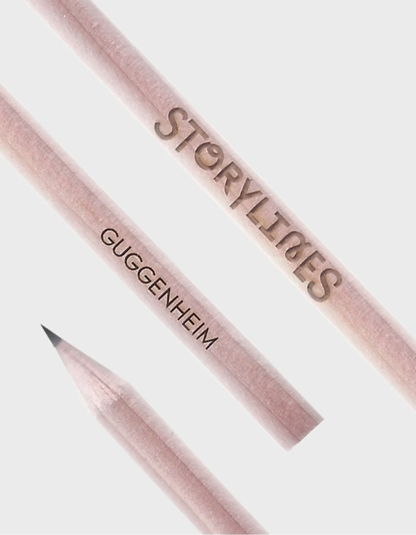
Pink wooden pencils printed with STORYLINES and GUGGENHEIM
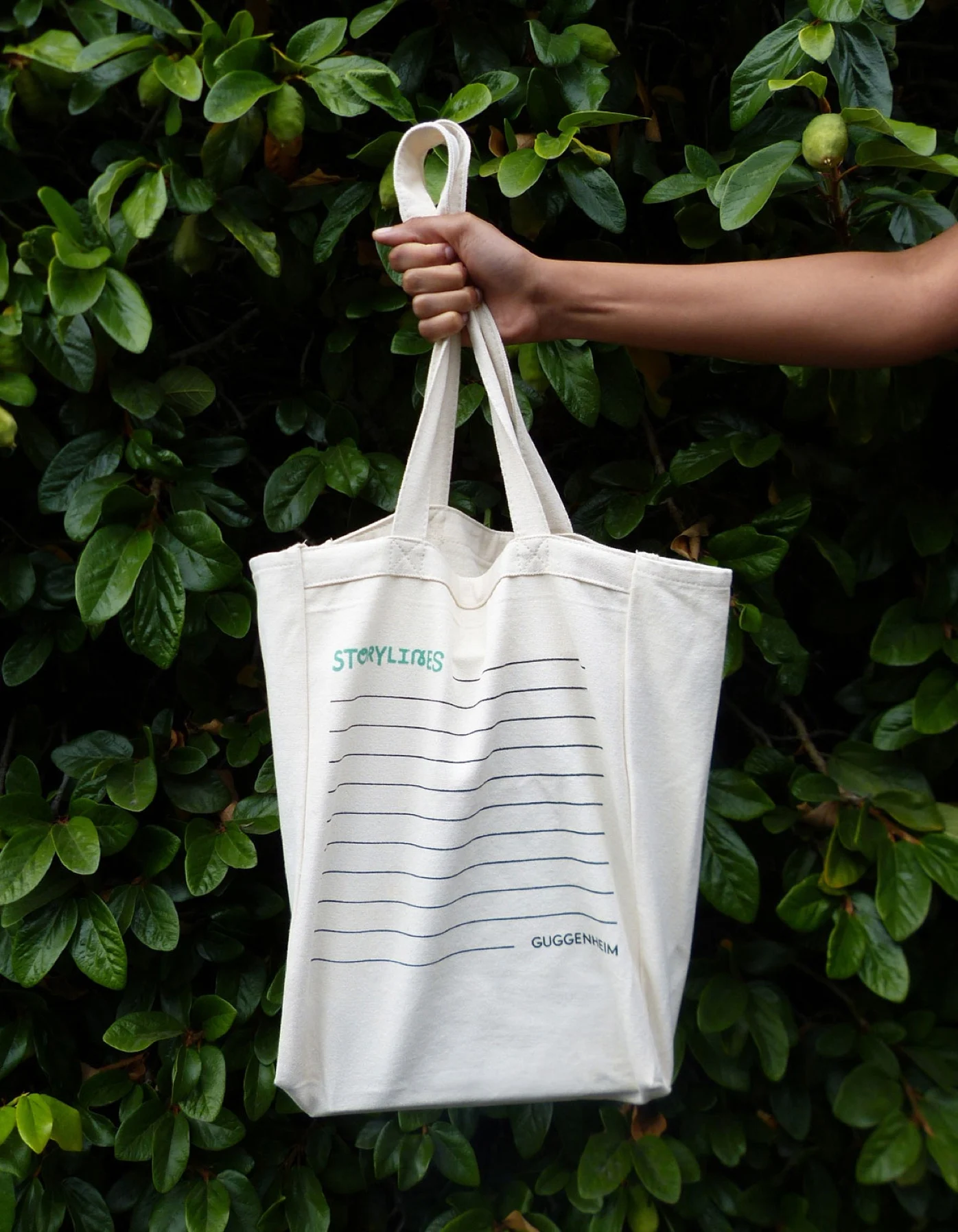
Canvas tote with Storylines branding and ruled lines held up against green leaves